For the best commercial painting in East Bay companies, there is no job that’s too big or too small for them. They can always be relied on to provide painting services to different types of businesses – shopping malls, cafes, restaurants, offices, residences, and hotels.
Speaking of hotels, what do you expect when you’re going to stay in one? You want it to be nice, clean, comfortable and complete with amenities, right? The “comfort” and “relaxing” factor of a hotel doesn’t only rely on the softness of the bed and the bedsheets, the hot showers or the majestic view of the peaceful sea from your suite’s veranda. It also relies on the right use of paint colors on the walls of every hotel suite and, to a lesser extent, the lobby.
Color plays a big impact on product and service branding. Not surprisingly, a lot of people buy a certain product or patronize a business because they are attracted by the colors in either the company logo or packaging. Understanding how your customers react to certain colors enables you to pick the right colors for the hotel you’re operating.
As a rule of thumb in painting a space, light colors make a room look bigger, brighter, cleaner and more spacious; dark colors, on the other hand, make a room more snug, intimate and sophisticated. Both colors will work well depending on the type and size of the suite – or maybe even the preferences of their guests and patrons.
If you still have no idea which color scheme to pick to decorate hotel suites, perhaps you may consider the following suggestions:
1. White
White always symbolizes cleanliness – something which your guests want when they’re seeking a place to stay. But too much white on the walls may look sterile and cold, and this may give your guests the impression of staying inside a hospital room instead of a hotel room. Add some pop of color to the all-white walls to create balance, enhance the appearance of the space and make it look more inviting.
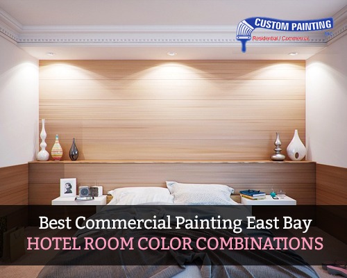
2. Brown
Brown is the color of calmness, security, and stability. It is the natural color of wood which is often a fixture of many hotel features such as doors, frames, built-in cabinets and furniture. Brown is a versatile color which can be paired with a lot of other colors depending on the shade. However, brown usually goes best with white trims which add an interesting contrast. Brown is also good when paired with creamy neutrals such as cream-colored drapes and bedsheets.
3. Yellow
Depending on the shade of yellow, this color can be serene especially when paired with the other proper colors. Add a crisp white to the room for a more polished look and green for a more relaxing feel. Avoid too bright yellows though, as it can make guests feel less relaxed and more agitated.
4. Gray
Gray is often used in many buildings, offices, and businesses. It’s because it evokes neutrality and balance. It also suggests sophistication, that’s why it is also a popular color in hotels. Depending on the shade, gray goes great with almost every accent color, from whites to browns to even pinks.
5. Blue
The color of the cloudless sky and the deep ocean, blue is the color of serenity and security. It’s a cool and soothing color, that’s why many hotels use various shades of blue to attract tired guests looking for a place to relax. But you should be careful in using too much blue, as it can evoke feelings of sadness and depression.
6. Purple
Purple is a combination of warm (red) and cool (blue) colors. It represents richness, creativity, and royalty. On the flip side, it also suggests decadence, pomposity, and vanity. Like with many other colors, the wise use of purple can have a positive effect on your guests. It is often paired with white on the trims and the ceiling to create balance and contrast without losing the relaxing and intimate vibe.
The power of paint colors is truly amazing. By only a coat of paint, you can radically and dramatically transform the look of a space. But this will only be achieved when you hire only the best commercial painting East Bay contractors who are also trained to paint the most ideal colors combinations for hotels and many other interior spaces.
